Web Accessibility Myths 2011 part 2

At the end of 2011 I published the first part of my Web Accessibility Myths 2011 blog, detailing 6 myths that are holding back the effectiveness of the arguments of many accessibility advocates.
The response from the web accessibility community was excellent, with many expressions of support for my views, and much discussion around them, some of which has already improved this follow-up.
In today’s part two, I’m going to cover ten more important myths, around audience, personalisation, assistive technology use, and mobile website use, which also need puncturing for us to be more effective.
I hope this spurs us on to further discussion, and more success in 2012.
New: get it in pictures…
7. Accessibility and inclusive design are anti-creative
 This is so far away from being the truth it appals me that we still have to combat this myth now, even though myths articles back to Webcredible’s in 2005 have tried to shoot it down.
But it’s still out there, prompted no doubt by all the occasions an accessibility advocate has vetoed a great bit of design because it’s not accessible for everyone.
What time-starved people often miss is that accessibility isn’t anti-creative but should actually prompt more creativity. As I say in my Beyond Inclusion and Reverse Inclusion blog:
“Anyone who says accessibility or inclusion constrains creativity just isn’t trying hard enough. For me, it’s the most challenging, creative work I’ve ever had the pleasure to be involved with. Putting together the needs of disabled and elderly people and the possibilities available through emerging technologies is the most creative game in town.”
My blog is full of examples of inclusion prompting great creativity and innovation – check it out for ammunition to fight this myth.
A number of inclusion organisations and I are planning to hold some events this year where we invite people in the creative industries to talk with us on this subject. If you’d like to be part of that, please contact us.
8. Accessibility and inclusive design help everyone
 Sorry, but this isn’t the case.
While the aim of accessibility and inclusive Design is to produce a website or app that works for everybody, that is rarely deliverable because different groups of people may have conflicting needs and preferences.
To give an example that is too rarely considered, let’s take the key accessibility aim of simplicity.
This is one need that all disabled and elderly groups have in common. Hardly anyone would disagree that they want products to be as simple as possible.
Simplicity generally means less functionality, but we usually accept that. Think of the simplicity of Apple phones, or of the original Google homepage…
The problem is that we all expect this on our own terms. We all want simplicity. But we don’t want products to sacrifice the functionality we particularly want in the cause of that simplicity. And, while most people can agree what the most important ‘core’ aspects of a website are, we often disagree about what ‘less important’ functionality is essential.
What’s worse, even the biggest purveyors of ‘simple’ – Google and Apple – love adding functionality to their products, because that’s what counts for progress (and media coverage) in the web world. Apple added over 200 new features to iOS 5. And Google are sneaking in functionality around the edges of their homepage ‘to give more prominence to their other services‘.
I’m not saying they’re wrong – I like what I see of iOS 5, and google are doing a great job of keeping the core functionality of their search product separate from the rest of the services you may or may not want.
But this tends to prove that the only way of giving each person the ‘simple’ version of a website or product they want is via personalisation.
And thankfully the web is built perfectly for this. We’ve been playing with customisation with iGoogle and the BBC homepage for years, although often we’ve not got it quite right yet.
Is that why so many people are afraid of it in the accessibility world?
We should be the greatest advocates for personalisation, based on an understanding of users’ needs, rather than users’ less important preferences.
For Inclusive Design to truly help everyone, it has to include personalisation (as Erlend Øverby commented on part one of this blog). Otherwise we aren’t availing ourselves of one of the main benefits of the web: that it’s software.
Let’s hope initiatives like GPII, Cloud4All and MyDisplay start to make inroads into making this more accepted this year.
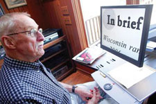
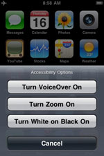
9. Disabled people use assistive technologies
 This sounds obvious, right? It’s at the heart of our ideas about accessibility…
Unfortunately it’s also untrue for many disabled people.
Research that I commissioned at the BBC found the following two facts:
- 57% of all computer users (aged 18-64) are likely or very likely to benefit from the use of Assistive Technology to help their computer use (Microsoft/Forrester Research Study, 2003, USA)
- 6-8% of web users use an Assistive Technology to access the Internet (Office for Disability Issues, 2008, UK)
Granted there might be differences between research methodologies, and the Forrester research was in the USA while the ODI research was in the UK. But the difference between 6-8% and 57% is huge and hard to ignore.
Positively, this means that there is a huge potential untapped market out there for Assistive Technologies. Negatively, it means that many of the people who would benefit from those Assistive Technologies are currently not doing so. Which also means that one of the pillars on which most accessibility thinking is based is rather shaky.
So if you were assuming that all your potential disabled users would be able to use your site if you coded it right, you may need to think again.
We are currently expecting disabled and elderly people to have ‘helped themselves’ to the right Assistive Technologies. But deeper research has found that, even with helpful websites like My Web My Way (which I won the BIMA for in 2006) and organisations like AbilityNet to help people get the ATs they need, this is expecting too much from many disabled people.
So don’t be surprised if disabled and elderly people want your website to provide some features which browsers or Assistive Technologies can already give them, like text resize controls or the ability to change colour schemes.
Thankfully ways ahead are being looked at, in the area of personalisation: check out my full slides on the research and vision behind MyDisplay, and the GPII.
10. Accessibility’s just about blind people – now for platforms
 Accessibility is not just about blind people – they just shout loudest and, via the RNIB in the UK and NFB in the USA at least, have the strongest (and most litigious) advocacy communities.
In fact, if you look at the numbers of people in different disabled groups who could benefit most from considerations of accessibility, the 180,000 blind people are a tiny fraction of the picture. In fact they only make up 1.6% of the disabled population of the UK. And the percentage figures in other countries are around the same.
Yet much of accessibility thinking is still mired in trying to help less than 2% of the people who might benefit.
Many of the accessibility advocacy community (including those who are blind) have been trying to bust this myth for years, and I think we’ve generally got our message across for web accessibility now, although NFB’s action against Google Docs has probably muddied the waters somewhat.
However, the same myth seems to have moved from web accessibility to platforms: operating systems, digital devices and mobile accessibility.
How else do you explain Apple’s iPhone accessibility policy that, for those outside the organisation at least, seems to be: do all we can to make all of our products work for blind people (and some less vision-impaired people), and forget everyone with other disabilities? While this is great for blind people, it seems to make no sense economically, and can only be understood by looking at America’s Section 508, which is still very biased towards blind people’s needs. This means, if Apple want their products in American schools, they have to make them work for blind people, to the exclusion of looking at the business case behind making them work better for other disabled and elderly people.
And it’s not just Apple, Google’s Android has much the same focus.
Unfortunately the accessibility advocacy community aren’t really challenging this. If you look at the sessions on mobile at the world’s top accessibility conference – CSUN 2012, at which I’m speaking on Case-studies of implementing BS8878 – you’ll find most are about the needs of blind and vision impaired users, and rarely are the needs of groups like people with dyslexia mentioned.
Hopefully, Section 508′s rewrite (now available for public comment) will reflect the number of people with each disability rather more than how loud their advocacy group are. It can’t come soon enough for those with dyslexia, literacy or learning difficulties, whose lobbyists aren’t getting leverage any other way.
11. Text is more accessible than other media
 If more people in the accessibility community appreciated myth 10, this myth would have already been busted. Unfortunately, that’s not the case yet.
So here it is in black and white: text is not the pinnacle of accessibility.
Ask the four million people in the UK who have dyslexia, literacy or learning difficulties. These guys would love you to remove much of the text from your website, and replace it with carefully selected, informational images and video.
I’d love it if, for a while at least, we turned the accessibility orthodoxy on its head, and all text had to have a ‘video equivalent’ created for it ‘for accessibility reasons’.
Although the cost would be considerable, that 360-degree change would make the web more accessible for more disabled people. And it might make all of us think a bit more, and understand that multimedia is good, not bad, for accessibility.
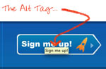
12. The most important accessibility requirement for images is alt-text
 Again, in a world where blind people’s needs are paramount this myth would be true.
But in the real world, where there are larger numbers of people who prefer images to text than people who can’t see images, the most important thing to remember about accessibility of images is: to choose your image well.
Make sure your image serves its purpose, communicates what you are trying to say, and ideally does so in a way that someone who can’t understand the text alongside it can still get the gist of what you are communicating.
That’s hard to do. There is an art to choosing the right image – just ask any picture/art editor. And everyone, including me, needs to start appreciating those picture editors more and learning from their experience (or, even better, get yourself on John Corcoran’s brilliant Beyond Big Type inclusive design training). They may have a more important role to play in making sites and apps accessible than we give them credit for.
Which brings us onto another huge myth…
13. The most important people in accessibility are developers
 I don’t want to play down how important it is for people like Rich Schwerdtfeger, Bruce Lawson and Steve Faulkner to get WAI-ARIA and HTML 5 into the right shape to give us the right technical framework on which to build accessible code.
Their work is essential and necessary to enable accessibility.
But it’s not sufficient to make people actually implement it.
As I said in my BS8878 introductory article in 2010, accessibility is facilitated or constrained by many people in web production teams, and most notably by the team’s Product Manager. If there’s a point person we really need to get on side, they are likely to have that job title, as they manage the product’s backlog.
Put it this way: who do you think has more impact on whether Apple products include accessibility features: Steve Jobs, or the developers behind iOS and OS-X? As Walter Isaacson’s fascinating biography of Steve Jobs makes clear, he dictated what functionality and look and feel would be in Apple products; the developers just had to make happen what he wanted.
And if you want to see who’s next in the importance list, I’d suggest the Procurement Manager, as many products are now mashed together from commercial off-the-shelf software (COTS). And, if you’re the Product Manager of a COTS, you’ll only prioritise accessibility over other possible features of your product if you know that Procurement Managers are going to require this in deciding whether to purchase your software.
That’s why web procurement standards, like the forthcoming Mandate 376 in Europe and the updated Section 508 in the States, may be as essential to accessibility’s future as WAI-ARIA and HTML 5.
14. It doesn’t matter if your mobile site/app isn’t accessible, just as long as the desktop version is
 Granted, it’s still in debate whether the mobile and desktop versions of a site constitute separate services in legal terms (lawyer Martin Sloan and I are still having a great discussion on it…)
However, let’s look at some demographics. Disabled people are less likely to be working than non-disabled people (sad but true). So they are more likely to be in the C2DE demographic. And, according to research from the UK Dept of Work and Pensions (no link yet I’m afraid), people in this demographic are more likely to access the web through a cheap smartphone than a laptop + broadband connection.
So, if you can’t afford to make both your desktop and mobile sites accessible, it might just be worth considering focusing on the mobile site or app’s accessibility, not the desktop version’s.
15. Websites have to be accessible from the start
 While Ian Pouncey has already addressed a variant on this myth – Content that isn’t 100% accessible shouldn’t be published – I believe it’s still prevalent among much of the accessibility community because we miss the iterative nature of much of web development and publication, where websites and apps go through version after version quickly.
Most of the best minds in web product management believe version 1 of a website needs to be a minimal viable product, with a versioning strategy to improve it over time (see my How to know when your site is ready to launch blog).
However our understanding of the ‘reasonableness’ of accessibility rarely takes this into account. We all know that accessibility costs less if it’s implemented from the early phase of a project (often having a variant on Bill Graham’s chart on the cost of repairing defects at different stages of production in our minds).
So we get scared if accessibility isn’t factored in right at the start.
And we forget to consider the other factors in the business model of the organisations we advise.
For example: you’ll rarely get accessibility onto the agenda of a start-up which is still playing with ideas of what its website should be. And that’s usually a good choice for sites trying new and innovative ideas that may or may not work. I still agree with DirectGov’s decision to leave accessibility until they created their beta service, and it would have been foolhardy to have held back BBC iPlayer’s launch (in Dec 2005) until audio-described programmes could be included (in August 2009).
If we advocates understand the realities of organisations’ business models, we’ve got a much better chance of picking our moment to engage.
So maybe accessibility from the start isn’t always essential.
Maybe a better strategy would focus on embedding inclusive design thinking into organisations when they are re-architecting their products as they become successful. Because if we don’t embed accessibility in the organisation’s culture, successive versions of their products might include or discount accessibility based on the whim of the team doing that version at that time.
16. BS8878 is just for huge companies
 So, if embedding accessibility is important in the long term, what’s the best way of doing it?
As the lead-author of British Standard BS8878 I guess I’m biased, but it’s the only accessibility Standard that has been developed to help organisations do that embedding, and many organisations in the UK are already gaining the benefits of this.
However, some people are unsure whether the Standard can help smaller organisations and SMEs, or if it’s just for large organisations with lots to lose from neglecting accessibility.
To address this misconception I’ve already published the first 3 blogs in a series of 16 on How BS8878 can help SMEs create good websites.
Note that I say ‘good websites’ rather than ‘accessible websites’ because BS 8878 has been shown to help SMEs create effective websites, not just accessible ones.
There will be more blogs from me this year on the rest of the steps of BS8878. Please sign up to the Hassell Inclusion newsletter to make sure you don’t miss them.
Have your say – shape the debate
So there you go – the start of a New Year has hopefully been a good time to clear out these particular myths. Thanks for reading.
The points in my blog are challenging to many accepted views of accessibility. But they are based on years of the sort of strategic research we do at Hassell Inclusion, and I believe they would make accessibility advocates more effective.
And you can make this blog more effective by contributing your experience here. So please:
- leave me a comment if you agree and want to add to my arguments; or
- leave me a comment to tell me where your research and experience says I’m wrong
And, if you’ve liked these insights, sign up to the Hassell Inclusion newsletter for more as 2012 progresses.
As always, I’ll base them on the best research I can find.
Comments
Bill says
An informative article overall, but just two observations. Viewing in FF, Chrome, Opera & Safari browsers on my system, the background colors of the required fields are initially displayed in red, not light yellow. A bit confusing, if nothing else, yet doesn’t that approach of using color by itself to indicate an action violate some accessibility standards? Secondly, you have basically addressed the communication value (or function) of using images in a presentation; still, none of those in your article are accompanied by an alternative description. I guess you might say it’s because they’re simply decorative in nature, but you might also agree that they serve an important function relative to communications value … value that is not available to those not seeing the images. I think the nature of subjectivity in cases like this — and those of more complexity — is a real challenge for truly understanding accessibility and universal design.
Jonathan Hassell says
Many thanks for your comment, Bill.
You’re right about the required fields displaying red, and about using colour itself to indicate status violating WCAG.
Many thanks for finding this problem with my comment form. While I had found and fixed a number of accessibility problems with the Temple Gate theme (which was itself supposed to be WCAG AA compliant) I’ve used for my blog, I missed this one in my testing.
I’ve done more tweaking tonight and the required fields are now indicated by a ‘*’ as well as the yellow colour.
Interestingly, having checked the code, the red colour that was showing up is supposed to be a hint that the words entered into the required fields are invalid (no name, or an email address without a ‘@’). This hinting is actually a good thing for accessibility (it’s the ‘Error Indication Checkpoint SC 3.3.1’ in WCAG 2.0 ). However the implementation isn’t good as it relies on people being able to see the red colour rather than ‘indicat[ing] the error in other ways such as image, color etc, in addition to the text description.’
I’ve not found a way tonight of getting the theme to give me a text description of errors, as well as the colour. But at least I’ve added explanation text now above the fields to explain the red colour for people who can see it while I look for a solution.
So thanks for finding this accessibility problem with my site’s theme, and sorry if it caused you any difficulty.
With respect to your second point regarding alternative descriptions: many thanks for allowing me the chance to explain something I didn’t include because I thought it would make the blog too long.
All the images in the blog are decorative in nature, due to the way I tend to write blogs. As I think in words rather than images, everything I wanted to communicate in the blog is fully expressed in words. There’s nothing in any of the images which isn’t already in the text around them. So I made the images’ alt-text null intentionally to avoid unnecessary repetition for screenreader users.
If anything, my accessibility critique of the style of communication in my blogs is that they are primarily text-based and I haven’t really found a successful way yet of getting across my sometimes complex points in simple images for those who don’t want to read the text.
You’ll find mention of this limitation in my accessibility statement. And it’s something I’m working on. Possible solutions I’m considering:
1) including a text-to-speech solution on my site; and
2) finding a cartoonist to create funny visual cartoons of my blogs.
I like option 2 best, so if there are any budding cartoonists who’d like to get in touch, I’d love to work with you.
Ted Page says
“I’d love it if, for a while at least, we turned the accessibility orthodoxy on its head, and all text had to have a ‘video equivalent’ created for it ‘for accessibility reasons’.”
Hi Jonathan
Surely such a scenario would severely restrict access to content creation. The web would become the exclusive property of people with very deep pockets. Not sure how that would increase access.
Jonathan Hassell says
Hi Ted,
Thanks for your comment.
Obviously my point re ‘video equivalents’ was a little for effect. I’m not seriously expecting people to do this.
Although I feel, if they did, that creation of video as the core media of the web rather than text wouldn’t be anywhere near as expensive as you think.
A whole generation seem to have no difficulty in shooting video on their smartphones and publishing it on a whim via YouTube or Facebook. So no deep pockets are required, unless you want broadcast quality or want to continually edit the content of the video.
So, the question then is: is video a less accessible communication medium than text? And I don’t think it is.
Put it this way: pretty much everyone seems to have the capacity to understand information communicated via video or TV (as long as the right access services – captions or audio-description – are included), whereas most countries still have a ‘literacy problem’ where a small number of their population cannot read or write text well at all. So video seems to be more universally accessible for the consumption of content.
And from experience I have of working with people with learning difficulties, it seems that enabling people to create web content as video rather than text would open up the creation of content to groups of people who at the moment have little or no voice online.
So maybe it’s not such a bad idea after all…
Oliver Tse says
Yes! Yes! Yes! Absolutely, positively, the most important people in accessibility are not web developers. They’re Product Managers, Directors, VPs, Senior VPs of the organization that you’re in. They’re the champions and if you want a product to be accessible you have to reach out to them first.
Kiran Kaja says
Excellent article.
But you may have missed an important consideration in point 10. There is another reason for accessibility being mainly talked about in the context of blind people.
More often than not, technical solutions to enable blind people use software applications and the web require a significantly more effort. Further, some of the technologies such as text to speech engines, platform accessibility APIs and keyboard access benefit blind people more than other groups. For video, blind people need audio description which may be more difficult to provide than captioning.
However, I do not think that increased focus on solutions for blind people isn’t necessarily a bad thing. A number of dyslexic people use text to speech (not screen readers specifically), screen magnifiers also rely on platform accessibility APIs and alternative input devices can hook into the keyboard access features provided by platforms and applications. Some of the newer software for AAC also uses platform accessibility APIs which were originally intended to provide an interface for assistive technologies such as screen readers.
I do agree that more work needs to be done for certain areas such as text captioning, RTT and solutions for dyslexic users.
But I do have to point out that solutions for blind people because of their complexity do help other disability and user groups. So, increased focus on that user group even though the group is miniscule isn’t necessarily detremental to usability or inclusive design.
Jonathan Hassell says
Hi Kiran,
Many thanks for your feedback.
I’d agree that focus on blind people isn’t necessarily detrimental to usability or inclusive design, and also that the APIs created for desktop platforms have been very useful for enabling the creation of a whole ecosystem of Assistive Technologies for people with many different disabilities.
However, in the mobile space, which is arguably the most important one going forwards, the APIs which allow ecosystems to be set up seem to be lagging behind the solutions for blind people.
While Android seems to be working to be very open for developers to develop the same sorts of assistive technologies available on desktops, as far as I can see Apple are much more closed – please correct me if I’m wrong here.
The other constraining aspect of mobile is the relative lack of the expandability of the software included in the operating system, which makes it even more important that the operating system and bundled apps provide facilities as standard.
To give you an example, for people who want to change website colours, fonts or text-size… On a desktop, you can do this by many different mechanisms: via options in the operating system, options in the browser, or installing browser toolbars to give you a better user-interface to this functionality. But, on something like an iPhone, your options are very limited. The operating system doesn’t provide any help. Nor does the default Safari browser, which doesn’t have any options for this, and doesn’t allow toolbars to be downloaded to help. And your options to install a different browser which does allow either of these is also rather limited (is Firefox or Chrome available from the App Store? I can’t see them…). So you’re left with nothing, unless the website you’re browsing has controls like this itself.
APIs and hooks in the operating system and apps are always useful, but I don’t see mobile platforms doing enough in that area yet, so development of solutions for disabled people’s access needs tends to be constrained to the people creating the OS.
That’s why when they spend all the time they have marked for ‘accessibility’ on the needs of a small population of disabled people, when other disabled people’s needs are better ‘low hanging fruit’, I believe that’s short-sighted.
I’d really love to be wrong on this, and for someone to show me the equivalent of Firefox’s accessibility toolbars on Android or TextHelp’s ATs for iPhone – anyone know if there existence?
Kim says
I always like reading articles that challenge the way we think. We need more of that from people who really know their subject.
As you move forward in other context I would really like to see you bring together the needs of disabled and people with limitations in their tech use (not all people who could be academically labeled disabled think of themselves as such).
What I’m trying to say is that blind people need to understand the importance of having the TSP of course, but they also need to understand the needs of having captions, well placed and selected images-that yes, are tagged.
People who are blind have a clear policy argument to make to non-disabled people. Non-visually impaired people can understand quickly how not being able to see a screen would prohibit use; other so called hidden disabilities are much harder for people to understand.
Creating understanding across various disability groups and using the model that advocates for the blind have developed would be a stronger approach than trying to chip away for each type of disability. Get the people with visual impairments and blindness behind you and we can help each other out.
Also, we need more people with disabilities working outside of the “disability” field and state government. We can create more change if we are working from within, where products and services are developed and delivered.
Metadas Media says
Great Article, Thank you and keep up the good work.
Mike Osborne says
Love the video equivalent for text idea – I know you don’t mean it literally but the sentiment is spot on.
software as a service companies says
Hi there, just wanted to tell you, I liked this blog post.
It was helpful. Keep on posting!