Is input type=”date” ready for use in accessible websites?

HTML5 introduced a series of new input types for use in forms. One of these – input type="date" – was intended to simplify the collection of dates, and to reduce user errors whilst doing so.
So in the 10 years since the proposed introduction of this element, is it well supported in browsers? And, for users of assistive technologies, and those who rely on keyboard interaction, does using it help make forms more accessible?
This article takes input type="date" for a test drive with a selection of browsers and assistive technologies to see how usable the control is in early 2019.
Stop Press: If you like what you read in this article, and want more, check out our new accessibility courses for Web Developers, where I can take you deeper into accessible web development.
How input type="date" is used
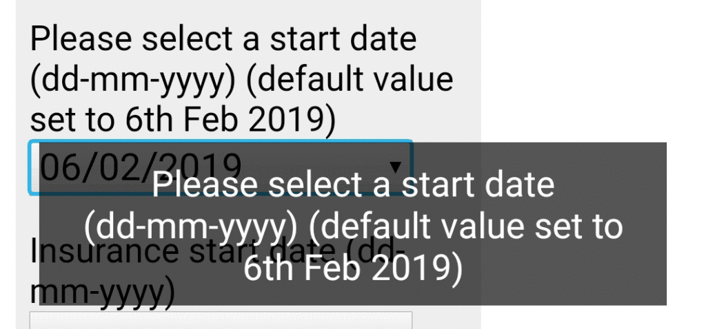
The simplest implementation of the element is just to declare the input type as date. A properly marked up label or prompt for the field should be provided so that screen reader users understand what the field is for, and Dragon NaturallySpeaking users can quickly reference the control.
<label for="start">Start date:</label>
<input type="date" id="start" name="start">
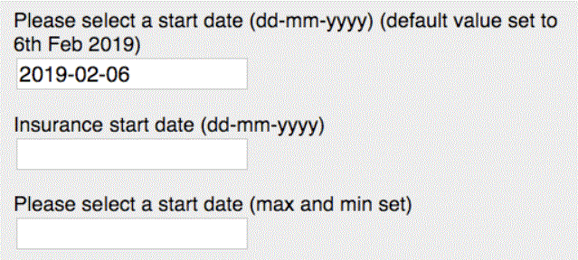
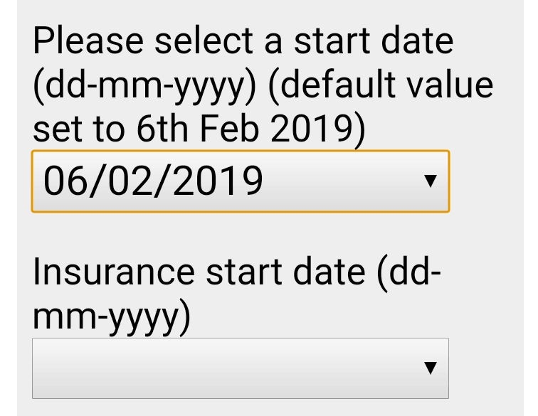
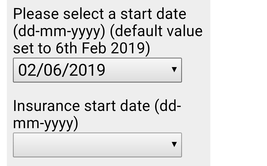
If required, a default (or previously stored) value can be set using the value attribute in the format ‘yyyy-mm-dd’.
Additionally, it is possible to set minimum and maximum allowed dates using the min and max attributes. The idea here is for the browser to validate the user’s input and warn them if it steps outside a valid range.
Here’s an example showing the use of all these attributes – to default to a date, and constrain the input to the following four weeks.
<label for="start">Start date:</label>
<input type="date" id="start" name="start"
value="2019-02-06"
min="2019-02-06" max="2019-03-05">
Our accessibility test requirements
Before we dive in to have a look at how input type="date" performs, I want to set our ideal requirements for this input type. You may notice this as a similar list to the ones defined in my blogs on Accessible accordion patterns and Using the <details> and <summary> elements.
- Can easily be operated by mouse users.
- Can easily be operated by touch – on smartphones, tablets or desktops/laptops with touch screens.
- Can easily be operated by keyboard – important for sighted keyboard-only users, and desktop/laptop screen reader users.
- Can easily be operated by speech recognition software, like Dragon NaturallySpeaking.
- Can easily be operated by users with screen magnification tools.
- Can easily be understood and operated by screen reader users – are they aware what’s expected of them?
Testing input type="date"
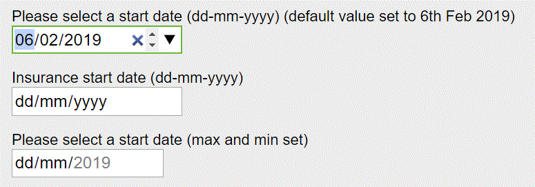
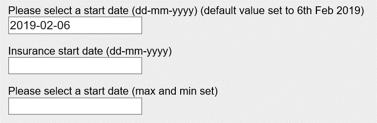
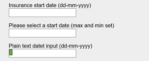
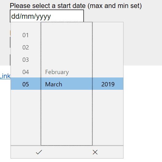
To help test the support for input type="date" I have constructed a date input test page. On this page I’ve included 3 date inputs. One of them has a default value set, one has a maximum and minimum value set, and one has no constrictions at all. I’ve also included a plain text box so that comparison can be made with a text box in browsers that don’t support input type="date".
In the tests I’m going to check how this input field type behaves in the following browsers, and with appropriate assistive technologies:
- Firefox 65 on Windows – including with NVDA screen reader.
- Chrome 72 on Windows – including with JAWS screen readers, and Dragon NaturallySpeaking
- Internet Explorer 11 on Windows – including with JAWS screen reader and Dragon NaturallySpeaking
- Edge 17 on Windows – including with JAWS screen reader and Dragon NaturallySpeaking
- Safari 12 on MacOS 10 – including with Voiceover
- Safari on iOS11 – including with Voiceover
- Chrome 72 on Android 8 – including with Talkback
- Firefox 65 on Android 8 – including with Talkback
- UTC Browser on Android 8 – including with Talkback
These documents were useful in planning my testing: support data for date inputs on Can I Use and a Smashing Magazine article about HTML5 input types which features a section on date inputs. The Mozilla Developer Network notes on date input also contain some information about testing for browser support for input type="date".
Summary of findings
Here is a summary of our test findings, for those who don’t have time to read all the detailed test findings.
Is there enough support for input type="date" to make it safe to use as part of an accessible website, or web based application?
While some browsers have pretty good support for input type=”date”, including our accessibility requirements, our answer, sadly, has to be… “No”.
My main reasons for coming to that conclusion are:
- It seems impossible to successfully interact with date inputs using Dragon NaturallySpeaking.
- The non-announcement of browser validation error messages in Safari/iOS with Voiceover and Firefox/Android with Talkback negates the useful built-in functionality of the control and means that more ‘conventional’ error validation would still be required.
- Some browser validation error messages follow the user-unfriendly ‘yyyy-mm-dd’ pattern rather than using the user’s locale settings.
- On Android devices with Talkback, in order to hear a previously selected date in a control, it is necessary to open the calendar view. The current value should be read out after the control’s label.
- Fields containing invalid dates sometimes have colour outlining, but are not always announced as invalid by screen readers.
- The lack of support in IE11, and more importantly in Safari on Mac. These browsers treat the date inputs as text boxes, which is not in itself an issue, but any default or previously entered date is shown in an unfriendly format, potentially confusing site visitors.
Voiceover focus moving to the top of the page after interacting with the calendar reels in Safari/iOS is also annoying, but it seems to be a feature of Safari when interacting with <select> elements too – it’s not a usability failure specific to input type="date".
The new HTML5 elements can offer so much to improve user experience and provide consistency and accessibility ‘out of the box’ to save developers time. But, as we saw with the <summary> and <details> elements, the concepts are currently let down by sloppy, or absent support from the browser and assistive technology manufacturers.
What do you think?
We hope these insights are useful to you, and would love to hear your experiences around implementing date controls. Please share your comments below.
Want more?
If this blog has been useful, you might like to sign-up for the Hassell Inclusion newsletter to get more insights like this in your email every month.
Detailed test findings
Firefox 65 on Windows
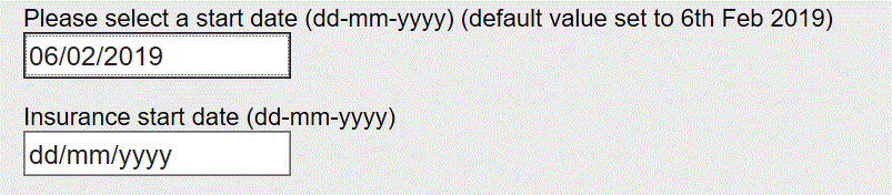
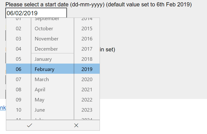
Firefox copes pretty well with input type="date". The initial view looks like a text box, and shows the default date in the correct format for the locale of my laptop – dd/mm/yyyy in my case. Date inputs without a pre-defined value also show ‘dd-mm-yyyy’ as if it was a placeholder.
Tabbing into the control reveals that keyboard users are actually dealing with three separate components, and the values can be changed by using the up and down arrow keys. Alternatively I can type directly into each part.

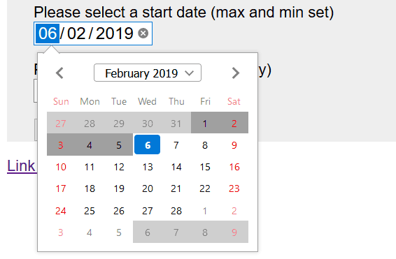
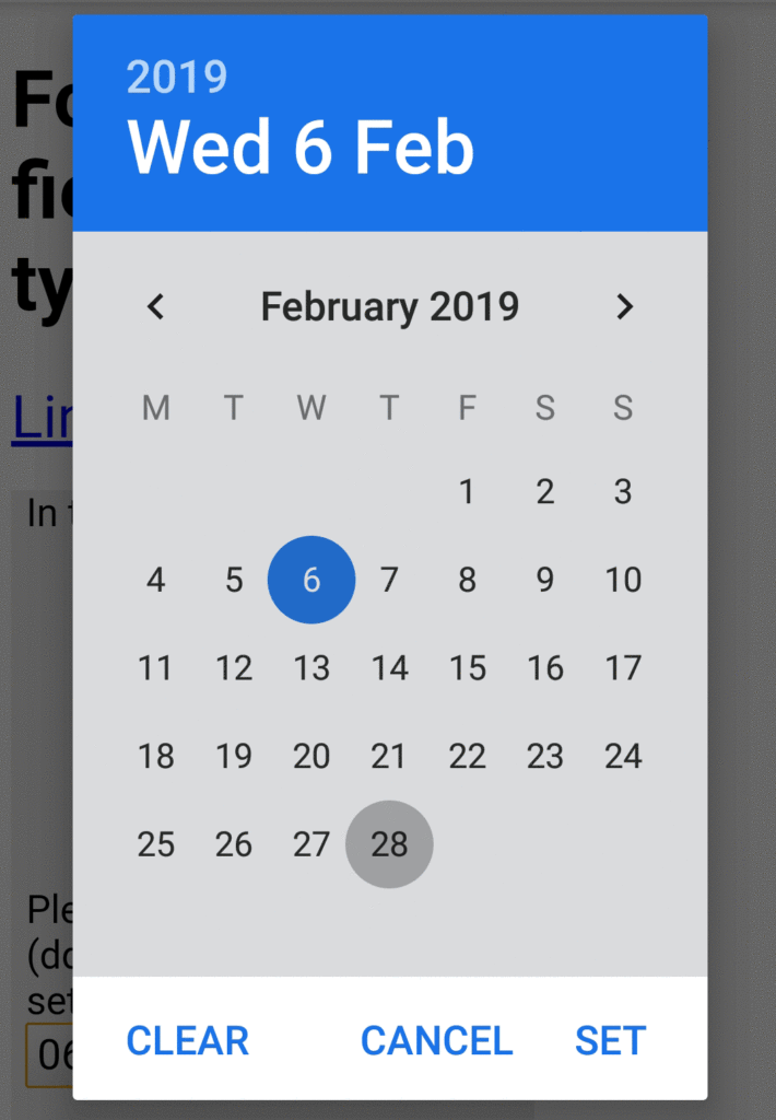
Clicking into the date control causes a calendar style date picker to appear. On dates where the min and/or max values are set, these are reflected in the calendar, and invalid dates cannot be selected using a mouse. There is also a highlight on the currently selected date.
Clicking on the small X icon within the box clears out the value completely.
Using a keyboard it’s possible to select invalid dates, but when the form is submitted, a browser-generated error message is shown. Note that the date in the error message is shown in the format yyyy-mm-dd – mirroring the actual value in the attribute, rather than a more human readable presentation.
So the element works pretty well in Firefox. But I have raised a bug on Bugzilla about the formatting of the message.
With NVDA
With Firefox, the best screen reader to use is NVDA as JAWS 18 does not play well with newer Firefox versions.
With NVDA running, when users come across the date control the label is read out and NVDA calls the control a “date edit”. It then goes on to voice which of the “spin buttons” you’re interacting with, and announces the current value. When moving between the “spin buttons” the label is only ever read out the first time. Using the up/down arrow keys to change the value, the new value is announced each time.
Submitting the form will cause any invalid dates – eg 31st February 2019 – to be called out by NVDA. Also, if the date falls outside either of any specified min or max values, the error message will be read out, using the less user-friendly yyyy-mm-dd format. These automatically announced messages do not include the field label, so a form with multiple date entries could leave screen reader users a little confused. However, tabbing to a field with an invalid date does cause the screen reader to announce invalid entry.
Chrome 72 on Windows
Similar to Firefox, Chrome for Windows copes pretty well with input type="date".
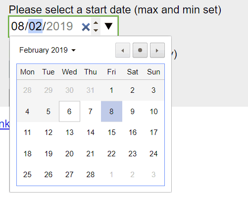
Once again, on initial view it looks like a text box, and where a default value is shown it is in a format appropriate to my locale. Clicking or tabbing into it reveals that there are three components – one each for day, month and year.
There is also a clickable X for clearing the input, and small up and down clickable arrows for changing the values. At the right-hand end there is a large down arrow which shows a calendar view when it is clicked .
Keyboard users can interact with each part using the up and down arrow keys to move through values, and it is possible to type a date directly into the control.
Opening the calendar view on date inputs where min and/or max values are set shows how valid dates and today’s date are differentiated. Invalid dates cannot be selected by mouse users in the calendar view.
If invalid dates are entered via the keyboard, and the form is submitted, a browser generated error message is shown. Note that, unlike Firefox, the error message contains the date in a more user-friendly format.
With JAWS
Using JAWS with Chrome gives me all the information I need to understand what the inputs are for and what is expected of me. It tells me when I am on the day, month or year and reads out the label (every time!). It tells me I’m on an ‘edit spin box’ and tells me that I can type the values or use the up or down arrow keys.
The spinners for day and month loop around when they reach the maximum possible values – 31 for day, 12 for month. I can also access the date picker by tabbing to the button and pressing the space bar. I’m instructed to use the arrow keys to move around the dates. And I can also select months separately too.
The only let-down to this accessible (if verbose) experience is that the browser-generated valid date error messages are not voiced by JAWS. So if the valid range is not specified in the label for the date input, JAWS users will not know why the form will not submit.
With Dragon NaturallySpeaking
With Dragon I cannot select the date fields, either by saying “click type text” or “click [label portion]”. I can place focus into the date fields by tabbing, and then saying “press enter” to open the calendar view, but then it seems impossible to interact with the calendar.
Alternatively, I can use “Mouse Grid” to click into portions of the date input, but once there I cannot dictate any numbers into the individual elements.
It seems that Dragon has no support for input type="date".
Internet Explorer 11 on Windows
As one might expect, Internet Explorer 11 does not support input type="date" in any special way. Instead the browser shows just a text box which is empty unless a value has been specified.
Sadly, where a value has been specified, IE11 shows the unmodified ‘yyyy-mm-dd’ format – which is not all user-friendly.
Not surprisingly, there is nothing to prevent users entering invalid dates where they are specified by attributes, and there is no inherent browser validation and error message when the form is submitted.
With JAWS
JAWS refers to the inputs as “Edit” just like it would for text boxes. The label is read out as you would expect.
Not surprisingly any default dates are read out in the non user-friendly ‘yyyy-mm-dd’ format.
With Dragon NaturallySpeaking
Although they may look like text boxes, Dragon does not see the inputs as text boxes. If I say “Click type text” I might expect Dragon to add its choice flags to the date inputs, but as we can see here, that doesn’t happen:
It also seems impossible to put focus onto the date input fields by quoting the label text, in any combination, which is something that I’d find easy with other input types.
As a last resort, I could use voice commands to tab to the date inputs, or use Mouse Grid to guide the mouse pointer. But, having done that, it seems not to be possible to dictate anything into the date input fields. That’s a substantial blocker.
Edge 17 on Windows
Whilst MS Edge on Windows disappointed when we were looking at support for <details> and <summary>, with input type="date" there is much better support.
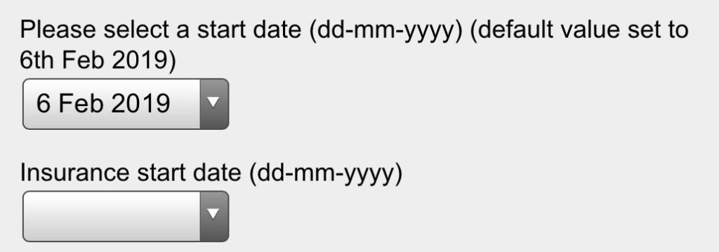
On initial view, the control looks like a text box, and the default value is presented according to my locale – for me ‘dd/mm/yyyy’.
When I tab to the control, the focus indication implies that it’s one input. However, I cannot type a date directly into the field. But if I instead press Enter, or click on the control, I’m shown a calendar interface that reminds me of the default iOS date picker (see iOS section below).
When this interface is shown, keyboard users can tab to each part and use the up/down arrow keys to change values, finally pressing Enter to finalise their selection, or Escape to close the interface without making a selection.
Touch screen users can drag the values up or down as required.
Mouse users don’t have it quite so easy, as they have to repeatedly click higher or lower to get near the value they want. So this control might not be so good for mouse users selecting a date of birth for example.
If min and max values are set, the calendar interface is curtailed accordingly, so it is good at preventing invalid input.
With JAWS
I cannot get anything meaningful out of any page using JAWS with Edge.
With Dragon NaturallySpeaking
I have never been able to successfully use Dragon NaturallySpeaking with Edge.
Safari 12 on MacOS 10
Sadly, support for date input seems to be completely absent in Safari on a Mac. The date input fields are presented as if they were text boxes, and the default value in the first field is not re-interpreted into a human readable format as with other browsers.
Another issue is that there is no browser validation and accompanying error message when invalid dates are entered or submitted.

When tested with MacOS Voiceover, the behaviour is just as if the fields were text boxes.
This means that Mac Safari is closest to IE11 in its treatment of input type="date". Some scripting functionality would be needed to present default values in a nicer format, and to provide field validation.
Safari on iOS11
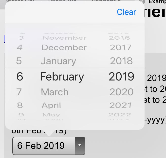
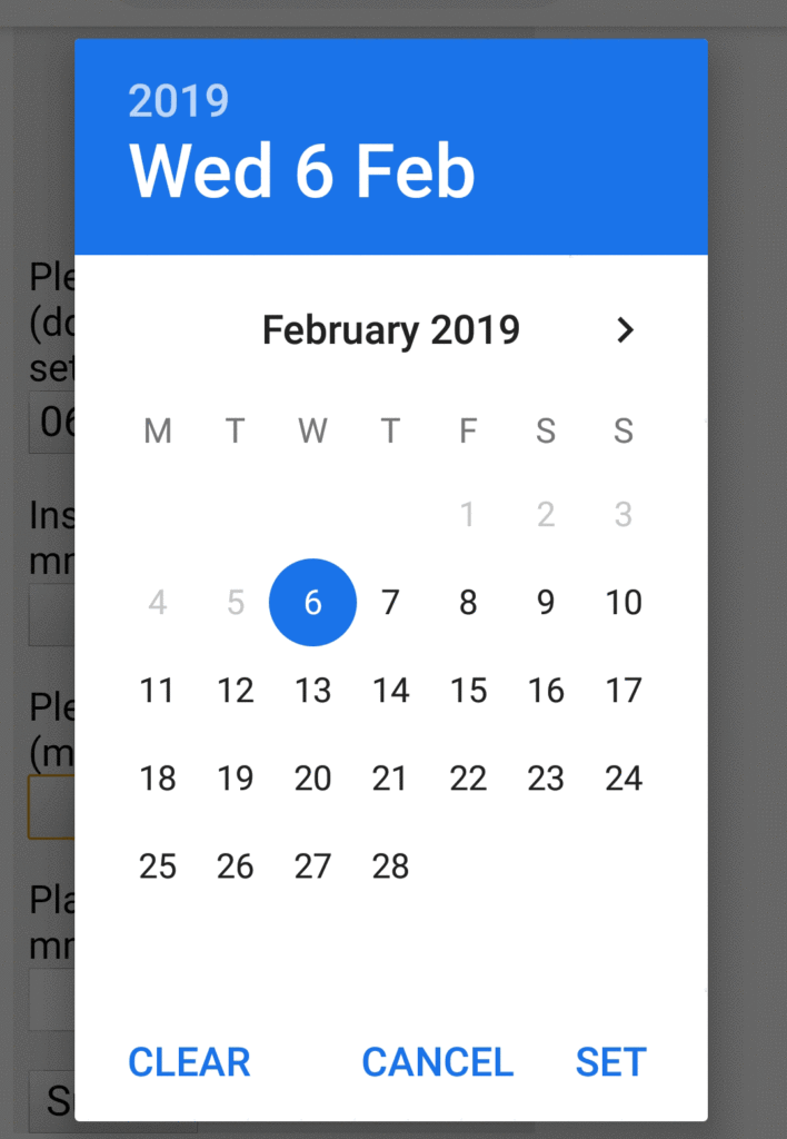
On initial view, the date inputs are displayed as if they were drop-downs. Where default dates are specified, they are show in human-readable form – example ‘6 Feb 2019’.
Touching on the control opens up the standard iOS 3-reel date picker, where users can move each one up and down separately to choose a date. The calendar spinners are dismissed by touching somewhere outside the calendar view – an action which selects the date currently shown within the calendar spinners.
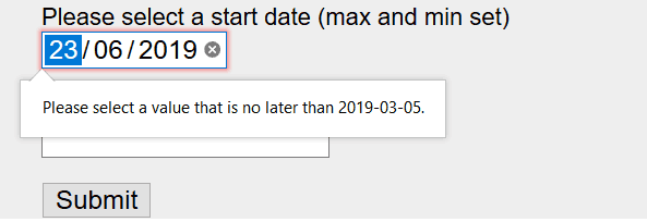
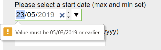
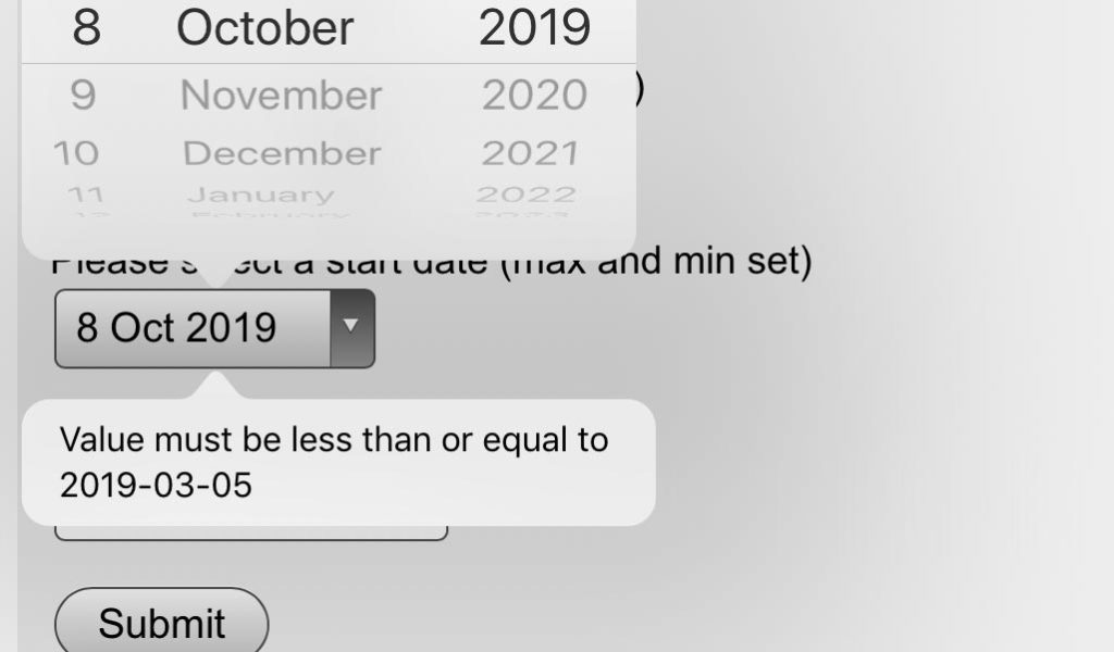
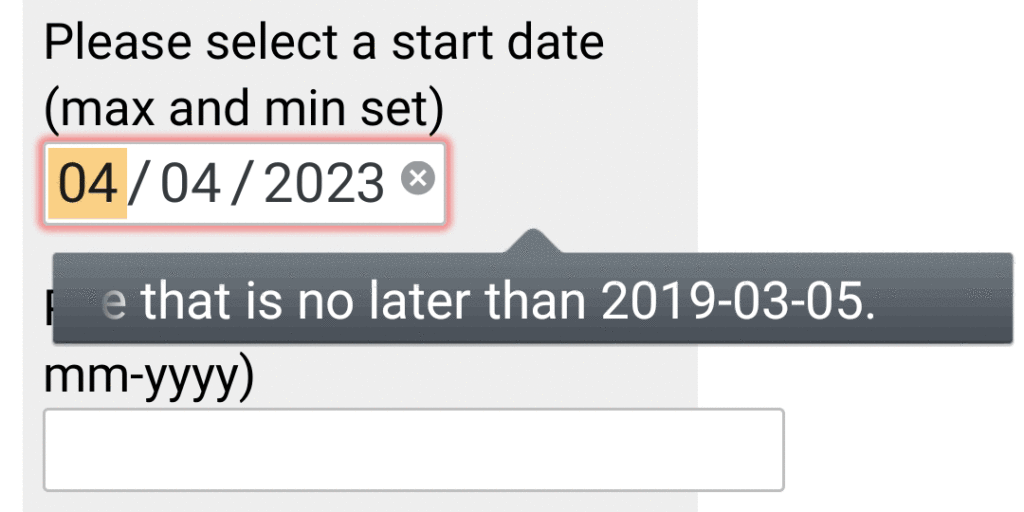
There is no restriction on the dates that can be selected, even in controls where a min and/or max date is specified. Submitting the form with an invalid date causes the calendar spinners to be shown again, and displays a browser-generated error message – “Value must be less than or equal to 2019-03-05”.
Note that the error message uses the non user-friendly yyyy-mm-dd format. And I’m not sure people think of dates in terms of ‘less than’ or ‘greater than’. Perhaps ‘before’ or ‘after’ would be better words to use.
Using Voiceover
When focus arrives at a date control, Voiceover refers to it as a ‘popup button’ and successfully reads out the label and any currently shown date.
Double-tapping on the control opens the calendar reels, but focus is on the ‘Clear’ button at the top. The user can swipe onto each of the three ‘picker items’ and swipe up or down to change the selection one step at a time. This seems to be normal behaviour for the iOS date picker.
In order to select a date, the Voiceover user needs to tap somewhere outside the calendar overlay and then double-tap. This action selects whatever date is shown in the calendar reels. But, frustratingly, it seems that Voiceover focus has now moved right up to the ‘Back’ arrow at the very top of the Safari screen.
That’s really poor usability, as I now need to find where I was on the page – either by swiping through, or moving my finger over the screen until I find it. It would be much better if the Voiceover focus remained on the date input I was just interacting with.
As mentioned above, where date inputs have min and/or max values set, and the form is submitted, an error message is generated by the browser. However, Voiceover never voices this message, not even why I manually try to slide my finger over it.
That is a huge problem in my view.
Chrome 72 on Android 8
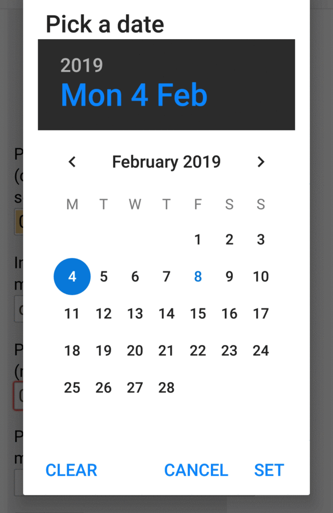
In Chrome on Android the date fields appear as a rectangle with a gradient background and a down arrow. Where default values are set, these are shown in the format appropriate to my locale – for me dd/mm/yyyy.
Tapping on the control brings up the default Android OS calendar view so that users can select a date. It is not possible to type a date into the control.
Where min or max values are set, invalid dates for the current month are shown in a lighter colour, and cannot be selected. Also the year option will only feature valid years. So it’s impossible to select an invalid date.
Once the calendar view is closed, there is a subtle focus indication around the control that was last interacted with.
Using Talkback
Using the standard OS calendar view should guarantee good accessibility, and if you are familiar with how the Android calendar view works, using Talkback to select a date is no problem at all. As before, it is not possible to select invalid dates.
However, one peculiarity of using Talkback is that if I swipe through date inputs where the value has already been set, Talkback will not announce the current value – unless I double-tap to open the calendar view, which causes Talkback to announce the previously selected date. This seems to be an unnecessary extra bit of work that screen reader users need to do.
Bluetooth keyboard
Using a Bluetooth keyboard (without Talkback) connected to the Android device presents no problem either. I can tab to the date fields and press Enter to cause the calendar view to open. I can then use the tab key and arrow keys to move focus as required to select alternate years, months, and then days when I’m in the desired month. Focus indication is obvious.
Firefox 65 on Android 8
Initial view of the date inputs shows them looking like text boxes. But, as with Chrome, touching into them shows the Android calendar view – albeit with a slightly different colour scheme. Note that the current date (8th February) is highlighted in a different colour.
Selecting a date via touch is exactly the same as with Chrome.
With Talkback
With Talkback running, the experience with Firefox is disappointing. Firstly, when moving to a date input, Talkback does not announce the label for the control when focus arrives on the control. Focus moves between the three parts of the input, and also the ‘/’ characters between the day, month and year parts. Talkback does not announce the current value of each of the parts of the input as I’m swiping through.

To hear the currently selected date, I must double-tap whilst on one of the input parts – an action which opens the Android calendar view. Focus goes initially to the year, and I need to forward swipe to hear the day and month. This forces users into many more gestures than they need to use – not a great experience.
If I’ve somehow chosen an invalid date, and I submit the form, using Talkback I never hear the browser-generated error message that is shown on the form. The date format in the error message matches the non user-friendly yyyy-mm-dd format. Note also that there is a red outline on the invalid field.
This is not a great experience.
Bluetooth keyboard
With a Bluetooth keyboard linked to the Android device, Firefox on Android behaves just like Firefox on a laptop. Tabbing to the date input reveals that I’m interacting with three elements and I can use the up and down arrow keys.
It is possible to select invalid dates using the keyboard, but attempting to submit the form causes an error message to be shown informing the user what is wrong with the date. Also, like the laptop version of Firefox, this error message references the date in the less than user-friendly yyyy-mm-dd format.
UC Browser on Android 8
Appearance and touch
Within the UC Browser (the world’s 4th most popular browser, used especially in China), the appearance and functionality of the date controls is just like Chrome on Android. The calendar view has a slightly different colour scheme, but otherwise everything works the same way.
With Talkback
It seems impossible to do much at all when using Talkback with the UC Browser, so that test was abandoned.
Bluetooth keyboard
With a Bluetooth keyboard attached, the UC Browser behaves substantially the same as Chrome does. Tabbing to the date inputs and pressing Enter pulls up the default Android calendar view and it can be controlled in the same way as you’d expect from Chrome.
The only disappointment is that keyboard focus on the input fields and buttons in the form is non-existent. So sighted keyboard users would find the UC Browser difficult to use.
What do you think?
We hope these insights are useful to you, and would love to hear your experiences around implementing date controls. Please share your comments below.
Want more?
If this blog has been useful, you might like to sign-up for the Hassell Inclusion newsletter to get more insights like this in your email every month.

Comments
bill says
Are there datepickers that have been tested as extensively as the native?
Overwhelming to think of all the differences of ‘presentation’ between all these access options.
Graham Armfield says
Hi Bill, thanks for your comment.
As a follow up post I’m going to be looking at the various different ways of capturing dates within forms, and the pros and cons of each. As part of that I’ve been investigating a number of date pickers. [Spoiler alert] Sadly most of the ones I’ve looked at have poor levels of accessibility in one way or another.
Robin A Blair says
Amazing work. Thanks for doing all this, and for such a well written write-up!
One thought. You keep saying the ISO format (yyyy-mm-dd) is not user friendly. Why is that? It’s the most unambiguous format we have, and I think it’s use should be widely encouraged. The confusion between the way Euprope and North America use dd-mm-yyyy and mm-dd-yyyy causes all kinds of issues (it’s fine if you see the format guide, but if all you see is 01-01-2020 then you’re left guessing).
For a localized audience opting to go with a localized date format would be fine, but for a global audience perhaps the ISO format is best (which I assume is what influenced the Broswer developers?)
Graham Armfield says
Thanks for your kind comments on the blog post.
My point around the ISO format is that, whilst I agree that it’s an unambiguous format, my view is that it’s one most people are least familiar with. So they’d have to think a lot more about their input.
I appreciate the differences between the European and US format can cause issues too, but I believe it’s really important that input fields always specify the expected format within the label for those fields. Hopefully that way most people will end up adding the dates in the right format.
Daniel says
I work supporting a wide range of people (often with limited resources and technical skills) that need to input birthdates on a range of devices (but usually mobile/Android), and the standard type=date calendar on mobile devices is horrendous and represents a huge accessibility roadblock to many non-technical users, especially the elderly.
The issue is that making the years drop-down is unintuitive on many mobile devices, and users–MOST users I encounter–resort to arrowing backward through the months, never seeing that the years can be directly accessed.
A form that should take moments to fill out therefore becomes a frustrating hurdle due to terrible consistency in the UI and thoughtless implementation on mobile.
Please don’t consider the accessibility issue one only for the deaf/blind or otherwise challenged. If you’ve ever tried to talk an 80 year old non-technical user–or a homeless person already on the edge using a phone with a tiny screen–through the standard date widget on mobile, you would see how genuinely awful it is. A simple text option with date validation should ALWAYS be an option.