Collecting dates in an accessible way

Whether it’s applying for car insurance, a credit card, or organising delivery of a birthday present, many forms on websites need to collect dates from users. But what’s the best way to do that which is accessible to everyone, and is there ever a trade-off between digital accessibility and usability for date entry?
Prompted by my recent blog on input type="date", this post looks at the pros and cons of a variety of methods for collecting date, and our views on the best practices.
Stop Press: If you like what you read in this post, and want more, check out our new accessibility courses for Web Developers, where I can take you deeper into accessible web development.
Our access requirements
Here’s a list of how we’d like accessible date capture to satisfy everyone’s needs. The list looks a bit similar to the list in my previous posts on accessible accordions and using <details> and <summary>.
- Can easily be operated by mouse users.
- Can easily be operated by touch – on smartphones, tablets or desktops/laptops with touch screens.
- Can easily be operated by keyboard – important for sighted keyboard-only users, and desktop/laptop screen reader users.
- Can easily be operated by speech recognition software, like Dragon NaturallySpeaking.
- Can easily be operated by users with screen magnification tools.
- Can easily be understood and operated by screen reader users – are they aware what’s expected of them.
Methods considered
We’ve looked at various date input patterns:
- Single date input text boxes.
- Three input boxes – one for each of day, month, year.
- Using JavaScript-driven date picker functionality.
- Using HTML5’s
input type="date"
1. Using single input field to collect dates
By far the simplest date entry method is to use one single text input field. Assuming that a suitably worded, and explicitly marked up label is provided, this solution would be usable by everyone.
As well as telling the user which date should be entered, the label element should clearly indicate the required format for the date. It’s also a good idea to add in aria-required="true" if the date entry is required.
Never use just a placeholder instead of a label, as this can cause issues for people with cognitive impairments, as placeholder text disappears as soon as the user starts typing in the input field (or as soon as it gets focus in IE11).
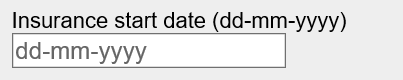
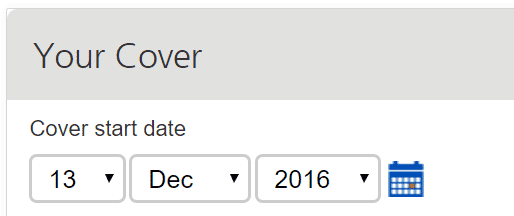
A good example:
<label for="ins-start">
Insurance start date (format dd-mm-yyyy)
</label> *<br>
<input type="text" aria-required="true"
id="ins-start" name="ins-start"
placeholder="dd-mm-yyyy" >
Which would typically look like this:
Validation would need to be run on the dates entered into the field – either in the browser itself, or when the data is submitted to a server. If validation fails, a suitable error message needs to be placed on the screen – ideally next to the input.
Other single input approaches can also be used:
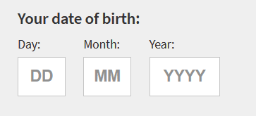
2. Using multiple input fields to collect dates
Another approach used by some sites is to use three input fields next to each other to collect a date. I’ve seen this done with all text boxes, all dropdowns, or a combination of the two types.
The idea here is to separate entry of the day, month and year which aims to help users enter a valid date.
Some examples
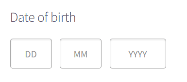
Another approach is to collect dates with three dropdown boxes.
As with a single input it is perfectly possible to make collecting dates accessible using three inputs side by side, as long as each input has a separate label.
Note that it is still possible for the user to select an invalid date. This could either be a non-existent date like 31st February 2010, or one that is outside a valid range – for example, start dates for insurance cover are often constrained to the next 4 weeks.
In instances where erroneous dates have been entered, suitably marked up error messages will be required – perhaps a message linked to each of the three inputs.
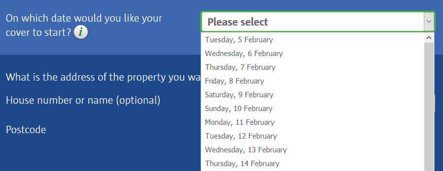
3. Using JavaScript driven date-pickers?
Now that JavaScript frameworks are commonly used for building sites, pop-up date-pickers have become popular with developers and designers.
Here’s an example:
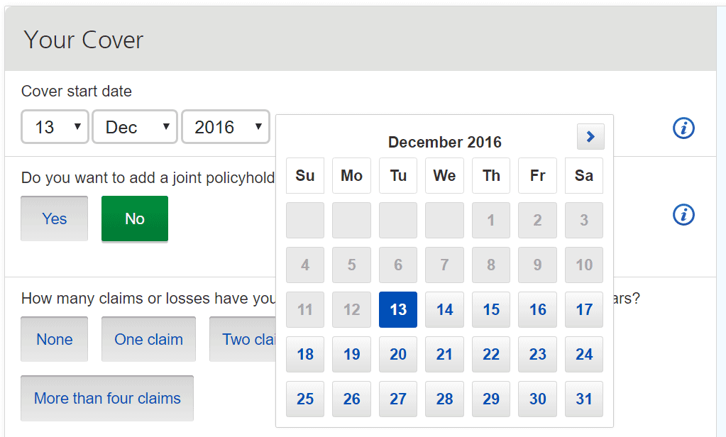
Date pickers can offer some users a quick and attractive way of choosing dates, and the visual calendar style may make entering dates easier to use for people with learning difficulties or dyslexia.
But date-pickers’ functionality can offer significant challenges to some groups of users. Let’s look at these challenges now:
Keyboard and screen reader use
Date pickers can be really slow and difficult to use for keyboard only users – who don’t have the option of moving their mouse pointer to the right date in the calendar view, and then clicking on it.
The first problem with some date pickers is that keyboard focus may not even move into the date picker when it appears. This makes interacting with the date-picker very hard or even impossible.
If focus does move into the date picker, where should it go? That perhaps depends on the date that is being collected, but possible candidates would either be the month name (December 2016 in the example above) or the current date.
Once focus is inside the date picker, how should a keyboard user move around? There needs to be a way for focus to land on each of the available dates in the current month as well as move to any controls to move to previous or next month. One approach would be to make each available date a button so that keyboard users could use the tab key to move around. But if the user wants to select a date at the other end of the month, that’s a lot of tabbing.
Some more accessible date-picker patterns allow movement via the arrow keys to move through the month – in a non-sequential way. Pressing the down arrow takes you to the same day next week, the up arrow to the previous week. Page Down and Page Up keys move to the corresponding date in the next or previous months. Pressing tab takes you to the next/previous month controls, and a Close button if one is provided. A convention for popups is that the Escape key should close the date picker without making a selection, and very importantly return the keyboard focus to an appropriate place – the input field or the calendar icon.
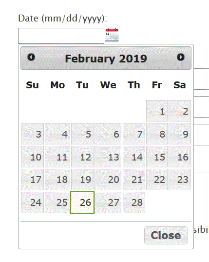
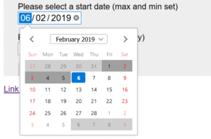
Here are a couple of examples that work like that for keyboard users:
The challenge with these components is how you let users know how they work. Designers rarely like having to include a full list of instructions on a page.
Screen reader users will also rely on good mark-up and good instructions to make sense of a date picker. Many date pickers are built from tables which is a sensible approach – the days of the week being the header cells, and the month name being the table caption.
Screen reader users will need appropriate labeling for the individual days to inform them if dates are invalid or previously selected.
The Deque University example has pretty good announcements, but doesn’t mention previously selected dates.
The Whatsock example does announce selected date – using aria-current=”date”.

Challenges for people with poor vision
Another challenge for users, especially those with poor vision or colour blindness is the method used for indicating date validity in date-pickers.
If we look at the date picker example above, the insurance start date can be any date within four weeks of the current date. So in the calendar shown we’ll need a way to indicate dates before today as invalid. Also, it would be useful to indicate if a date has already been selected – or allocated by default. Similarly, it may be useful to highlight today’s date. Sighted keyboard users would also need an obvious indication as to which date currently has focus whilst they are moving around the months.
So a number of different colour schemes will be required for each indication – each one needing sufficient colour contrast.
How accessible are date-pickers in current JavaScript frameworks
I have revieweda number of javascript framework date pickers:
- Sadly the ReactJS Datepicker and jQueryUI Datepicker are not fully accessible to either keyboard users or screen reader users.
- The Angular materials datepicker has some good points, but it’s easy for screen reader users to select invalid dates as there are no announcements to inform them that dates are not valid.
4. Using HTML5’s input type=”date”
The HTML5 specification from 2008 introduced a number of new semantic elements, and also a good collection of new input types including one for collecting dates: input type="date".
In theory the new HTML5 input types are there to help users enter correct information. But using them successfully relies on browsers and assistive technologies supporting the elements.
Unfortunately, browser support for input type="date" varies from ‘not at all’ for IE11 on Windows, and Safari on Mac, through to good comprehensive support from Chrome and Firefox on Windows.
On top of this, some assistive technologies – notably Dragon NaturallySpeaking – don’t support input type="date" at all. This makes this field types inaccessible to their users. My previous post Is input type=”date” ready for use in accessible websites? has a full rundown of browser and assistive technology support.
Summary of best practice
Currently, providing a usable and accessible method for collecting dates in forms is fraught with difficulty. Due to the lack of consistent and accessible support for input type=”date”, and the difficulty of finding date-pickers that are accessible to keyboard users and screen reader users, is it safest to just go back to using text boxes and dropdowns?
I believe you must include the include the ability for the user to enter a date using a text box or dropdowns – for keyboard-only users and screen reader users this is still the best and easiest option.
However, as we’ve seen, many people like date-pickers, including people with some disabilities, so if you wish to present a calendar-style date-picker:
- never force people to use it, but instead have it as an option triggered by a button, and
- hide the date-picker from screen reader users.
What do you think?
We hope these insights are useful to you, and would love to hear your experiences around collecting dates in forms.
And do you agree with our guidelines for date entry above?
Please share your comments below.
Want more?
If this blog has been useful, you might like to sign-up for the Hassell Inclusion newsletter to get more insights like this in your email every month.

Comments
Martin says
I do not think hiding the date picker for screen reader users is a good solution. A date picker provides useful information (letting you know which day of the week a certain date is). By hiding the date picker you’re offering a degraded experience to screen reader users. I would only consider hiding it if the day of the week is irrelevant in the context (e.g. when the users is entering their birth date, as opposed to booking a flight or a hotel for instance)
James Edwards says
You can’t hide it anyway. The datepicker and the button that opens it are interactive controls, and interactive controls cannot be aria-hidden.
Graham Armfield says
Yes James, you’re right. That could create an even more confusing experience for screen reader users.
Mike says
The standard way to handle dates in HTML5 is with type=”date”. If a specific browser is broken, that’s the fault of the browser, not the web page designer. Code to the standards if you ever want the browsers to support them.
Jonathan Hassell says
Thanks Mike. Appreciate your position, but it’s the user that suffers if you take this line. It’s not about fault, it’s about making sure the user gets a good experience whatever browser they are using.